Table of Content
- Item Name: Elegant Elements
- Item Version: Version 1.1.0
- Author by: Jablonczay
- Support via Email: Contact Link
What is the Elegant Elements?
The Elegant Elements is a lightweight jQuery Form Plugin to format form elements. You can create your own theme by duplicating an existing theme.
Why Choose the Elegant Elements?
- Easy to use
- No images may be used, every design elements are generated by CSS or vector font.
- Not required the CSS reset application (for example Normalize CSS reset)
- Predefined themes
- Responsive
- Support
Note!
I recommend to use the normalize.css reset for your project but everything works properly without in the Elegant Elements, too.
Which Elements are Formatted?
- Form
- Fieldset
- Legend
- Label
- Inputs (including the file input)
- Textarea
- Radio Button
- Checkbox
- Select
- Button
- Info Box
About font-family
The default value of font-family is 'inherit' so this property inherits from its parent element.
Tip: If you want to change the font-family, set to the parent element a different font-family value.
Responsive
The Elegant Elements is absolutely responsive. Don not need media queries, it works automatically. Check it on small screen size and see the radio/checkbox buttons and radio/checkbox groups that they're transformed into a vertical layout.
Helpers
There are some helper classes for the easy application:
- .ee-hide
- .ee-float-left
- .ee-float-right
- .ee-clear
- .ee-left
- .ee-center
- .ee-right
.ee-hide
If you add this helper class to the element, the element will not be displayed.
.ee-float-left
You can apply this helper class e.g. a button that you want to float to the left side.
.ee-float-right
You can apply this helper class e.g. a button that you want to float to the right side.
.ee-clear
If you add this helper class to the element, it specifies whether an element can be next to floating elements that precedes it or must be moved down below them.
.ee-left
You can apply this helper class e.g. a row in the form which contains button(s) to the button is aligned to the left side.
.ee-center
You can apply this helper class e.g. a row in the form which contains button(s) to the button is aligned to the center.
Tip: add this class to form or any container and all of the elements will be center alignes in the form.
.ee-right
You can apply this helper class e.g. a row in the form which contains button(s) to the button is aligned to the right side.
Browser Support
The Elegant Elements works in every major browsers.
- Google Chrome 49+
- Mozilla Firefox 48+
- Internet Explorer 11
- Microsoft Edge
- Opera 35+
- Safari 6+
Getting Started #back to top
Copy the elegant-elements folder to your server's document root folder, next to your index.html file. The elegant-elements folder contains the css, js and fonts folders.
-
Add the font-awesome free icon font library to the head section if you would like to apply some high quality vector icons:
<link rel="stylesheet" href="http://your-domain.com/elegant-elements/css/font-awesome.min.css">Add the Elegant Elements CSS files to the head section on your page:
<link rel="stylesheet" href="http://your-domain.com/elegant-elements/css/themes/elegant-elements-business.css">
<link rel="stylesheet" href="http://your-domain.com/elegant-elements/css/elegant-elements.min.css">
The elegant-element-business.css file is just an example. You can add any theme CSS available in the themes folder.
If you want to use the default theme, it is not necessary to add the theme CSS file.
-
Add the JavaScript files to the head or the body section on your page:
<head>
    …
    <script src="http://your-domain.com/elegant-elements/js/jquery-3.1.0.min.js"></script>
    <script src="http://your-domain.com/elegant-elements/js/elegant-elements.min.js"></script>
    <script>
    $(document).ready(function () {
        var elegantElements = new $.ElegantElements();
        elegantElements.init();
    });
    …
    </script>
</head>
It is possible to modify some parameters:
<script>
    $(document).ready(function () {
        var elegantElements = new $.ElegantElements({
            radioAndCheckboxFullWidth: true,
            radioAndCheckboxAutoFocusOut: true,
            buttonAutoFocusOut: true,
            manualUpdate: false
        });
        elegantElements.init();
    });
</script>
Parameters:
- radioAndCheckboxFullWidth: The default value is true. The radio and checkbox elements to align vertically when the width of the container element smaller than the width of the sum of the elements. If this parameter is true, the items' width is 100%. In case of false, the items' width is equal to the widest item's width.
- radioAndCheckboxAutoFocusOut: The default value is true. This parameter will help to restore the radio and checkbox elements to appear before the click. In case of false, there is no interference to the basic operation and the elements appear in :focus state.
- buttonAutoFocusOut: The default value is true. This parameter will help to restore the button elements to appear before the click. In case of false, there is no interference to the basic operation and the elements appear in :focus state.
- manualUpdate: The default value is false. This parameter will help to update the elements manually.
Methods:
- update: Events can be manually attached to elements that have been added to DOM tree after loading the page.
<script>
    $(document).ready(function () {
        var elegantElements = new $.ElegantElements();
        elegantElements.init();

        // When you send an AJAX request
        // and the response is e.g. one or more checkbox(es)
        // you insert the DOM tree
        // you can call the following method to update.
        $.get('path/file.html', function (response) {
            $('body').append(response);
            elegantElements.update('checkbox');
        });
    });
</script>
It is possible to call the update method with different parameters:
- elegantElements.update('radio'): Updates all newly added radio elements.
- elegantElements.update('checkbox'): Updates all newly added checkbox elements.
- elegantElements.update('select'): Updates all newly added select elements.
- elegantElements.update('fileInput'): Updates all newly added file type input elements.
- elegantElements.update('infoBox'): Updates all newly added info boxes.
- elegantElements.update('button'): Updates all newly added button elements.
- elegantElements.update(): Updates all newly added elements.
It is recommended to use the update method with parameter because it results in faster operation than without it.
After the dynamically inserted elements, the update method call is needed for the following reasons:
- The screen size dependent vertical alignment on radio and checkbox elements
- Disabled state management on radio, checkbox, select, and file input elmeents
- Auto focus out on radio, checkbox and button elements for click event
- Close button on the info boxes
Insert the Elegant Elements HTML samples and customize them.
Code Samples #back to top
Layout
Apply a Theme
This section is the container element. All elements using the theme settings should be within the container like the .ee-theme-nature. You can add the theme class to the html, the body or a div tag. If you do not set a theme class to container, the elements will display the default theme settings. In this case you do not need to add the theme CSS file to the head section.
<div class="ee-theme-nature">
    …
</div>
Form
<div class="ee-theme-nature">
    <form class="ee-form" action="#" method="post" enctype="multipart/form-data">…</form>
</div>Fieldset and Legend
<div class="ee-theme-nature">
    <form class="ee-form" action="#" method="post">
        <fieldset class="ee-fieldset">
            <legend class="ee-legend">I'm a legend</legend>
        </fieldset>
    </form>
</div>Row
You can add any form control inside this element. See below…
<div class="ee-theme-nature">
    <form class="ee-form" action="#" method="post">
        <fieldset class="ee-fieldset">
            <legend class="ee-legend">I'm a legend</legend>
            <div class="ee-row">
                I'm a row.
            </div>

            <div class="ee-row">
                I'm a row.
            </div>

            <div class="ee-row">
                I'm a row.
            </div>
        </fieldset>
    </form>
</div>Label
<div class="ee-row">
    <div class="ee-label">I'm a label</div>
    …
</div>Label with Required Mark
A red star signs if the element is required.
<div class="ee-row">
    <div class="ee-label ee-required">I'm a label</div>
    …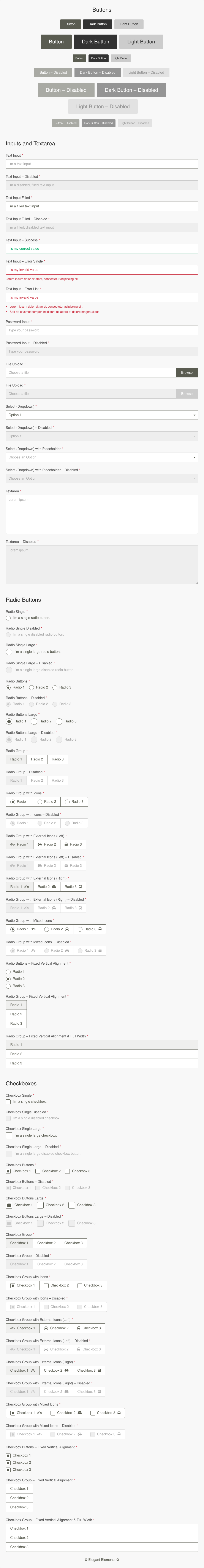
</div>Inputs & Textarea
Text Input
<div class="ee-row">
    <div class="ee-label ee-required">Text Input</div>
    <input class="ee-control" type="text" name="text" placeholder="I'm a text input">
</div>
Text Input – Disabled
<div class="ee-row">
    <div class="ee-label ee-required">Text Input – Disabled</div>
    <input class="ee-control" type="text" name="text-disabled" placeholder="Lorem ipsum" value="I'm a disabled, filled text input" disabled>
</div>
Text Input Filled
<div class="ee-row">
    <div class="ee-label ee-required">Text Input Filled</div>
    <input class="ee-control" type="text" name="text-filled" placeholder="Lorem ipsum" value="I'm a filled text input">
</div>
Text Input Filled – Disabled
<div class="ee-row">
    <div class="ee-label ee-required">Text Input Filled – Disabled</div>
    <input class="ee-control" type="text" name="text-filled" placeholder="Lorem ipsum" value="I'm a filled, disabled text input" disabled>
</div>
Text Input – Success
If the form is sent and the response is valid, you can add the ee-success class next to the ee-row class and the green color will help for the user while filling out the datas.
<div class="ee-row ee-success">
    <div class="ee-label ee-required">Text Input – Success</div>
    <input class="ee-control" type="text" name="text-success" placeholder="Lorem ipsum" value="It's my correct value">
</div>
Text Input – Error Single
If the form is sent and the response is invalid you can add the ee-error class next to the ee-row class and the instruction as well as the red color will help for the user while filling out the datas.
<div class="ee-row ee-error">
    <div class="ee-label ee-required">Text Input – Error Single</div>
    <input class="ee-control" type="text" name="text-error-single" placeholder="Lorem ipsum" value="It's my invalid value">

    <div class="ee-error__item">
        Lorem ipsum dolor sit amet, consectetur adipiscing elit.
    </div>
</div>
Text Input – Error List
<div class="ee-row ee-error">
    <div class="ee-label ee-required">Text Input – Error List</div>
    <input class="ee-control" type="text" name="text-error-list" placeholder="Lorem ipsum" value="It's my invalid value">

    <!-- Use the 'ee-hide' class to hide this list. -->
    <ul class="ee-error__list">
        <li class="ee-error__list-item">
            Lorem ipsum dolor sit amet, consectetur adipiscing elit.
        </li>
        <li class="ee-error__list-item">
            Sed do eiusmod tempor incididunt ut labore et dolore magna aliqua.
        </li>
    </ul>
</div>- Lorem ipsum dolor sit amet, consectetur adipiscing elit.
- Sed do eiusmod tempor incididunt ut labore et dolore magna aliqua.
Password Input
<div class="ee-row">
    <div class="ee-label ee-required">Password Input</div>
    <input class="ee-control" type="password" name="password" placeholder="Type your password">
</div>
Password Input – Disabled
<div class="ee-row">
    <div class="ee-label ee-required">Password Input – Disabled</div>
    <input class="ee-control" type="password" name="password-disabled" placeholder="Type your password" disabled>
</div>File Upload
Before uploading the file, a text appears as a placeholder, which is in the value of the data-ee-file-placeholder attribute.
<div class="ee-row">
    <div class="ee-label ee-required">File Upload</div>
    <label class="ee-file">
        <input class="ee-file__input ee-control" type="file" name="file">
        <span class="ee-file__text ee-placeholder-color" data-ee-file-placeholder="Choose a file">
            Choose a file
        </span>
        <a class="ee-file__remove" href="javascript:void(0);" title="Remove">Remove</a>
        <span class="ee-file__btn ee-btn" title="Browse">Browse</span>
    </label>
</div>
File Upload – Disabled
<div class="ee-row">
    <div class="ee-label ee-required">File Upload</div>
    <label class="ee-file">
        <input class="ee-file__input ee-control" type="file" name="file-disabled" disabled>
        <span class="ee-file__text ee-placeholder-color" data-ee-file-placeholder="Choose a file">
            Choose a file
        </span>
        <a class="ee-file__remove" href="javascript:void(0);" title="Remove">Remove</a>
        <span class="ee-file__btn ee-btn" title="Browse">Browse</span>
    </label>
</div>Select (Dropdown)
<div class="ee-row">
    <div class="ee-label ee-required">Select (Dropdown)</div>
    <div class="ee-select">
        <select class="ee-control" name="select">
            <option value="1">Option 1</option>
            <option value="2">Option 2</option>
            <option value="3">Option 3</option>
        </select>
    </div>
</div>
Select (Dropdown) – Disabled
<div class="ee-row">
    <div class="ee-label ee-required">Select (Dropdown) – Disabled</div>
    <div class="ee-select">
        <select class="ee-control" name="select-disabled" disabled>
            <option value="1">Option 1</option>
            <option value="2">Option 2</option>
            <option value="3">Option 3</option>
        </select>
    </div>
</div>
Select (Dropdown) with Placeholder
<div class="ee-row">
    <div class="ee-label ee-required">Select (Dropdown) with Placeholder</div>
    <div class="ee-select">
        <select class="ee-control" name="select-with-placeholder">
            <option value="" disabled="" selected="">Choose an Option</option>
            <option value="1">Option 1</option>
            <option value="2">Option 2</option>
            <option value="3">Option 3</option>
        </select>
    </div>
</div>
Select (Dropdown) with Placeholder – Disabled
<div class="ee-row">
    <div class="ee-label ee-required">Select (Dropdown) with Placeholder – Disabled</div>
    <div class="ee-select">
        <select class="ee-control" name="select-with-placeholder-disabled" disabled>
            <option value="" disabled="" selected="">Choose an Option</option>
            <option value="1">Option 1</option>
            <option value="2">Option 2</option>
            <option value="3">Option 3</option>
        </select>
    </div>
</div>Textarea
<div class="ee-row">
    <div class="ee-label ee-required">Textarea</div>
    <textarea class="ee-control" name="textarea" placeholder="Lorem ipsum"></textarea>
</div>
Textarea – Disabled
<div class="ee-row">
    <div class="ee-label ee-required">Textarea – Disabled</div>
    <textarea class="ee-control" name="textarea-disabled" placeholder="Lorem ipsum" disabled></textarea>
</div>Radio & Checkbox Buttons
Radio Group
If a radio button is checked, its background changing.
<div class="ee-row">
    <div class="ee-label ee-required">Radio Group</div>
    <div class="ee-rdo-group">
        <ul class="ee-rdo-group__list">
            <li class="ee-rdo-group__item">
                <label class="ee-rdo-group__label">
                    <input class="ee-rdo-group__input" type="radio" name="radio-group" checked>
                    <span class="ee-rdo-group__text">Radio 1</span>
                </label>
            </li>
            <li class="ee-rdo-group__item">
                <label class="ee-rdo-group__label">
                    <input class="ee-rdo-group__input" type="radio" name="radio-group">
                    <span class="ee-rdo-group__text">Radio 2</span>
                </label>
            </li>
            <li class="ee-rdo-group__item">
                <label class="ee-rdo-group__label">
                    <input class="ee-rdo-group__input" type="radio" name="radio-group">
                    <span class="ee-rdo-group__text">Radio 3</span>
                </label>
            </li>
        </ul>
    </div>
</div>
Radio Group – Disabled
<div class="ee-row">
    <div class="ee-label ee-required">Radio Group – Disabled</div>
    <div class="ee-rdo-group">
        <ul class="ee-rdo-group__list">
            <li class="ee-rdo-group__item">
                <label class="ee-rdo-group__label">
                    <input class="ee-rdo-group__input" type="radio" name="radio-group-disabled" checked disabled>
                    <span class="ee-rdo-group__text">Radio 1</span>
                </label>
            </li>
            <li class="ee-rdo-group__item">
                <label class="ee-rdo-group__label">
                    <input class="ee-rdo-group__input" type="radio" name="radio-group-disabled" disabled>
                    <span class="ee-rdo-group__text">Radio 2</span>
                </label>
            </li>
            <li class="ee-rdo-group__item">
                <label class="ee-rdo-group__label">
                    <input class="ee-rdo-group__input" type="radio" name="radio-group-disabled" disabled>
                    <span class="ee-rdo-group__text">Radio 3</span>
                </label>
            </li>
        </ul>
    </div>
</div>
Radio Group with Icons
If a radio button is checked, its background changing. In addition, the radio icon may also sign the change.
<div class="ee-row">
    <div class="ee-label ee-required">Radio Group with Icons</div>
    <div class="ee-rdo-group ee-rdo-group--icon">
        <ul class="ee-rdo-group__list">
            <li class="ee-rdo-group__item">
                <label class="ee-rdo-group__label">
                    <input class="ee-rdo-group__input" type="radio" name="radio-group-with-icons" checked>
                    <span class="ee-rdo-group__text">
                        <span class="ee-rdo-group__icon"></span>
                        Radio 1
                    </span>
                </label>
            </li>
            <li class="ee-rdo-group__item">
                <label class="ee-rdo-group__label">
                    <input class="ee-rdo-group__input" type="radio" name="radio-group-with-icons">
                    <span class="ee-rdo-group__text">
                        <span class="ee-rdo-group__icon"></span>
                        Radio 2
                    </span>
                </label>
            </li>
            <li class="ee-rdo-group__item">
                <label class="ee-rdo-group__label">
                    <input class="ee-rdo-group__input" type="radio" name="radio-group-with-icons">
                    <span class="ee-rdo-group__text">
                        <span class="ee-rdo-group__icon"></span>
                        Radio 3
                    </span>
                </label>
            </li>
        </ul>
    </div>
</div>
Radio Group with Icons – Disabled
<div class="ee-row">
    <div class="ee-label ee-required">Radio Group with Icons – Disabled</div>
    <div class="ee-rdo-group ee-rdo-group--icon">
        <ul class="ee-rdo-group__list">
            <li class="ee-rdo-group__item">
                <label class="ee-rdo-group__label">
                    <input class="ee-rdo-group__input" type="radio" name="radio-group-with-icons-disabled" checked disabled>
                    <span class="ee-rdo-group__text">
                        <span class="ee-rdo-group__icon"></span>
                        Radio 1
                    </span>
                </label>
            </li>
            <li class="ee-rdo-group__item">
                <label class="ee-rdo-group__label">
                    <input class="ee-rdo-group__input" type="radio" name="radio-group-with-icons-disabled" disabled>
                    <span class="ee-rdo-group__text">
                        <span class="ee-rdo-group__icon"></span>
                        Radio 2
                    </span>
                </label>
            </li>
            <li class="ee-rdo-group__item">
                <label class="ee-rdo-group__label">
                    <input class="ee-rdo-group__input" type="radio" name="radio-group-with-icons-disabled" disabled>
                    <span class="ee-rdo-group__text">
                        <span class="ee-rdo-group__icon"></span>
                        Radio 3
                    </span>
                </label>
            </li>
        </ul>
    </div>
</div>
Radio Group with External Icons (Left)
<div class="ee-row">
    <div class="ee-label ee-required">Radio Group with External Icons (Left)</div>
    <div class="ee-rdo-group">
        <ul class="ee-rdo-group__list">
            <li class="ee-rdo-group__item">
                <label class="ee-rdo-group__label">
                    <input class="ee-rdo-group__input" type="radio" name="radio-group-with-ext-icons-left" checked>
                    <span class="ee-rdo-group__text">
                        <span class="ee-rdo-group__ext-icon ee-rdo-group__ext-icon--left fa fa-bicycle" aria-hidden="true"></span>
                        Radio 1
                    </span>
                </label>
            </li>
            <li class="ee-rdo-group__item">
                <label class="ee-rdo-group__label">
                    <input class="ee-rdo-group__input" type="radio" name="radio-group-with-ext-icons-left">
                    <span class="ee-rdo-group__text">
                        <span class="ee-rdo-group__ext-icon ee-rdo-group__ext-icon--left fa fa-car" aria-hidden="true"></span>
                        Radio 2
                    </span>
                </label>
            </li>
            <li class="ee-rdo-group__item">
                <label class="ee-rdo-group__label">
                    <input class="ee-rdo-group__input" type="radio" name="radio-group-with-ext-icons-left">
                    <span class="ee-rdo-group__text">
                        <span class="ee-rdo-group__ext-icon ee-rdo-group__ext-icon--left fa fa-bus" aria-hidden="true"></span>
                        Radio 3
                    </span>
                </label>
            </li>
        </ul>
    </div>
</div>
Radio Group with External Icons (Left) – Disabled
<div class="ee-row">
    <div class="ee-label ee-required">Radio Group with External Icons (Left) – Disabled</div>
    <div class="ee-rdo-group">
        <ul class="ee-rdo-group__list">
            <li class="ee-rdo-group__item">
                <label class="ee-rdo-group__label">
                    <input class="ee-rdo-group__input" type="radio" name="radio-group-with-ext-icons-left-disabled" checked disabled>
                    <span class="ee-rdo-group__text">
                        <span class="ee-rdo-group__ext-icon ee-rdo-group__ext-icon--left fa fa-bicycle" aria-hidden="true"></span>
                        Radio 1
                    </span>
                </label>
            </li>
            <li class="ee-rdo-group__item">
                <label class="ee-rdo-group__label">
                    <input class="ee-rdo-group__input" type="radio" name="radio-group-with-ext-icons-left-disabled" disabled>
                    <span class="ee-rdo-group__text">
                        <span class="ee-rdo-group__ext-icon ee-rdo-group__ext-icon--left fa fa-car" aria-hidden="true"></span>
                        Radio 2
                    </span>
                </label>
            </li>
            <li class="ee-rdo-group__item">
                <label class="ee-rdo-group__label">
                    <input class="ee-rdo-group__input" type="radio" name="radio-group-with-ext-icons-left-disabled" disabled>
                    <span class="ee-rdo-group__text">
                        <span class="ee-rdo-group__ext-icon ee-rdo-group__ext-icon--left fa fa-bus" aria-hidden="true"></span>
                        Radio 3
                    </span>
                </label>
            </li>
        </ul>
    </div>
</div>
Radio Group with External Icons (Right)
<div class="ee-row">
    <div class="ee-label ee-required">Radio Group with External Icons (Right)</div>
    <div class="ee-rdo-group">
        <ul class="ee-rdo-group__list">
            <li class="ee-rdo-group__item">
                <label class="ee-rdo-group__label">
                    <input class="ee-rdo-group__input" type="radio" name="radio-group-with-ext-icons-right" checked>
                    <span class="ee-rdo-group__text">
                        Radio 1
                        <span class="ee-rdo-group__ext-icon ee-rdo-group__ext-icon--right fa fa-bicycle" aria-hidden="true"></span>
                    </span>
                </label>
            </li>
            <li class="ee-rdo-group__item">
                <label class="ee-rdo-group__label">
                    <input class="ee-rdo-group__input" type="radio" name="radio-group-with-ext-icons-right">
                    <span class="ee-rdo-group__text">
                        Radio 2
                        <span class="ee-rdo-group__ext-icon ee-rdo-group__ext-icon--right fa fa-car" aria-hidden="true"></span>
                    </span>
                </label>
            </li>
            <li class="ee-rdo-group__item">
                <label class="ee-rdo-group__label">
                    <input class="ee-rdo-group__input" type="radio" name="radio-group-with-ext-icons-right">
                    <span class="ee-rdo-group__text">
                        Radio 3
                        <span class="ee-rdo-group__ext-icon ee-rdo-group__ext-icon--right fa fa-bus" aria-hidden="true"></span>
                    </span>
                </label>
            </li>
        </ul>
    </div>
</div>
Radio Group with External Icons (Right) – Disabled
<div class="ee-row">
    <div class="ee-label ee-required">Radio Group with External Icons (Right) – Disabled</div>
    <div class="ee-rdo-group">
        <ul class="ee-rdo-group__list">
            <li class="ee-rdo-group__item">
                <label class="ee-rdo-group__label">
                    <input class="ee-rdo-group__input" type="radio" name="radio-group-with-ext-icons-right-disabled" checked disabled>
                    <span class="ee-rdo-group__text">
                        Radio 1
                        <span class="ee-rdo-group__ext-icon ee-rdo-group__ext-icon--right fa fa-bicycle" aria-hidden="true"></span>
                    </span>
                </label>
            </li>
            <li class="ee-rdo-group__item">
                <label class="ee-rdo-group__label">
                    <input class="ee-rdo-group__input" type="radio" name="radio-group-with-ext-icons-right-disabled" disabled>
                    <span class="ee-rdo-group__text">
                        Radio 2
                        <span class="ee-rdo-group__ext-icon ee-rdo-group__ext-icon--right fa fa-car" aria-hidden="true"></span>
                    </span>
                </label>
            </li>
            <li class="ee-rdo-group__item">
                <label class="ee-rdo-group__label">
                    <input class="ee-rdo-group__input" type="radio" name="radio-group-with-ext-icons-right-disabled" disabled>
                    <span class="ee-rdo-group__text">
                        Radio 3
                        <span class="ee-rdo-group__ext-icon ee-rdo-group__ext-icon--right fa fa-bus" aria-hidden="true"></span>
                    </span>
                </label>
            </li>
        </ul>
    </div>
</div>
Radio Group with Mixed Icons
<div class="ee-row">
    <div class="ee-label ee-required">Radio Group with Mixed Icons</div>
    <div class="ee-rdo-group ee-rdo-group--icon">
        <ul class="ee-rdo-group__list">
            <li class="ee-rdo-group__item">
                <label class="ee-rdo-group__label">
                    <input class="ee-rdo-group__input" type="radio" name="radio-group-with-mixed-icons" checked>
                    <span class="ee-rdo-group__text">
                        <span class="ee-rdo-group__icon"></span>
                        Radio 1
                        <span class="ee-rdo-group__ext-icon ee-rdo-group__ext-icon--right fa fa-bicycle" aria-hidden="true"></span>
                    </span>
                </label>
            </li>
            <li class="ee-rdo-group__item">
                <label class="ee-rdo-group__label">
                    <input class="ee-rdo-group__input" type="radio" name="radio-group-with-mixed-icons">
                    <span class="ee-rdo-group__text">
                        <span class="ee-rdo-group__icon"></span>
                        Radio 2
                        <span class="ee-rdo-group__ext-icon ee-rdo-group__ext-icon--right fa fa-car" aria-hidden="true"></span>
                    </span>
                </label>
            </li>
            <li class="ee-rdo-group__item">
                <label class="ee-rdo-group__label">
                    <input class="ee-rdo-group__input" type="radio" name="radio-group-with-mixed-icons">
                    <span class="ee-rdo-group__text">
                        <span class="ee-rdo-group__icon"></span>
                        Radio 3
                        <span class="ee-rdo-group__ext-icon ee-rdo-group__ext-icon--right fa fa-bus" aria-hidden="true"></span>
                    </span>
                </label>
            </li>
        </ul>
    </div>
</div>
Radio Group with Mixed Icons – Disabled
<div class="ee-row">
    <div class="ee-label ee-required">Radio Group with Mixed Icons – Disabled</div>
    <div class="ee-rdo-group ee-rdo-group--icon">
        <ul class="ee-rdo-group__list">
            <li class="ee-rdo-group__item">
                <label class="ee-rdo-group__label">
                    <input class="ee-rdo-group__input" type="radio" name="radio-group-with-mixed-icons-disabled" checked disabled>
                    <span class="ee-rdo-group__text">
                        <span class="ee-rdo-group__icon"></span>
                        Radio 1
                        <span class="ee-rdo-group__ext-icon ee-rdo-group__ext-icon--right fa fa-bicycle" aria-hidden="true"></span>
                    </span>
                </label>
            </li>
            <li class="ee-rdo-group__item">
                <label class="ee-rdo-group__label">
                    <input class="ee-rdo-group__input" type="radio" name="radio-group-with-mixed-icons-disabled" disabled>
                    <span class="ee-rdo-group__text">
                        <span class="ee-rdo-group__icon"></span>
                        Radio 2
                        <span class="ee-rdo-group__ext-icon ee-rdo-group__ext-icon--right fa fa-car" aria-hidden="true"></span>
                    </span>
                </label>
            </li>
            <li class="ee-rdo-group__item">
                <label class="ee-rdo-group__label">
                    <input class="ee-rdo-group__input" type="radio" name="radio-group-with-mixed-icons-disabled" disabled>
                    <span class="ee-rdo-group__text">
                        <span class="ee-rdo-group__icon"></span>
                        Radio 3
                        <span class="ee-rdo-group__ext-icon ee-rdo-group__ext-icon--right fa fa-bus" aria-hidden="true"></span>
                    </span>
                </label>
            </li>
        </ul>
    </div>
</div>Checkbox Group
If a checkbox button is checked, its background changing.
<div class="ee-row">
    <div class="ee-label ee-required">Checkbox Group</div>
    <div class="ee-chk-group">
        <ul class="ee-chk-group__list">
            <li class="ee-chk-group__item">
                <label class="ee-chk-group__label">
                    <input class="ee-chk-group__input" type="checkbox" name="checkbox-group-1" checked>
                    <span class="ee-chk-group__text">Checkbox 1</span>
                </label>
            </li>
            <li class="ee-chk-group__item">
                <label class="ee-chk-group__label">
                    <input class="ee-chk-group__input" type="checkbox" name="checkbox-group-2">
                    <span class="ee-chk-group__text">Checkbox 2</span>
                </label>
            </li>
            <li class="ee-chk-group__item">
                <label class="ee-chk-group__label">
                    <input class="ee-chk-group__input" type="checkbox" name="checkbox-group-3">
                    <span class="ee-chk-group__text">Checkbox 3</span>
                </label>
            </li>
        </ul>
    </div>
</div>
Checkbox Group – Disabled
<div class="ee-row">
    <div class="ee-label ee-required">Checkbox Group – Disabled</div>
    <div class="ee-chk-group">
        <ul class="ee-chk-group__list">
            <li class="ee-chk-group__item">
                <label class="ee-chk-group__label">
                    <input class="ee-chk-group__input" type="checkbox" name="checkbox-group-disabled-1" checked disabled>
                    <span class="ee-chk-group__text">Checkbox 1</span>
                </label>
            </li>
            <li class="ee-chk-group__item">
                <label class="ee-chk-group__label">
                    <input class="ee-chk-group__input" type="checkbox" name="checkbox-group-disabled-2" disabled>
                    <span class="ee-chk-group__text">Checkbox 2</span>
                </label>
            </li>
            <li class="ee-chk-group__item">
                <label class="ee-chk-group__label">
                    <input class="ee-chk-group__input" type="checkbox" name="checkbox-group-disabled-3" disabled>
                    <span class="ee-chk-group__text">Checkbox 3</span>
                </label>
            </li>
        </ul>
    </div>
</div>
Checkbox Group with Icons
If a checkbox button is checked, its background changing. In addition, the checkbox icon may also sign the change.
<div class="ee-row">
    <div class="ee-label ee-required">Checkbox Group with Icons</div>
    <div class="ee-chk-group ee-chk-group--icon">
        <ul class="ee-chk-group__list">
            <li class="ee-chk-group__item">
                <label class="ee-chk-group__label">
                    <input class="ee-chk-group__input" type="checkbox" name="checkbox-group-with-icons-1" checked>
                    <span class="ee-chk-group__text">
                        <span class="ee-chk-group__icon"></span>
                        Checkbox 1
                    </span>
                </label>
            </li>
            <li class="ee-chk-group__item">
                <label class="ee-chk-group__label">
                    <input class="ee-chk-group__input" type="checkbox" name="checkbox-group-with-icons-2">
                    <span class="ee-chk-group__text">
                        <span class="ee-chk-group__icon"></span>
                        Checkbox 2
                    </span>
                </label>
            </li>
            <li class="ee-chk-group__item">
                <label class="ee-chk-group__label">
                    <input class="ee-chk-group__input" type="checkbox" name="checkbox-group-with-icons-3">
                    <span class="ee-chk-group__text">
                        <span class="ee-chk-group__icon"></span>
                        Checkbox 3
                    </span>
                </label>
            </li>
        </ul>
    </div>
</div>
Checkbox Group with Icons – Disabled
<div class="ee-row">
    <div class="ee-label ee-required">Checkbox Group with Icons – Disabled</div>
    <div class="ee-chk-group ee-chk-group--icon">
        <ul class="ee-chk-group__list">
            <li class="ee-chk-group__item">
                <label class="ee-chk-group__label">
                    <input class="ee-chk-group__input" type="checkbox" name="checkbox-group-with-icon-disabled-1" checked disabled>
                    <span class="ee-chk-group__text">
                        <span class="ee-chk-group__icon"></span>
                        Checkbox 1
                    </span>
                </label>
            </li>
            <li class="ee-chk-group__item">
                <label class="ee-chk-group__label">
                    <input class="ee-chk-group__input" type="checkbox" name="checkbox-group-with-icon-disabled-2" disabled>
                    <span class="ee-chk-group__text">
                        <span class="ee-chk-group__icon"></span>
                        Checkbox 2
                    </span>
                </label>
            </li>
            <li class="ee-chk-group__item">
                <label class="ee-chk-group__label">
                    <input class="ee-chk-group__input" type="checkbox" name="checkbox-group-with-icon-disabled-3" disabled>
                    <span class="ee-chk-group__text">
                        <span class="ee-chk-group__icon"></span>
                        Checkbox 3
                    </span>
                </label>
            </li>
        </ul>
    </div>
</div>
Checkbox Group with External Icons (Left)
<div class="ee-row">
    <div class="ee-label ee-required">Checkbox Group with External Icons (Left)</div>
    <div class="ee-chk-group">
        <ul class="ee-chk-group__list">
            <li class="ee-chk-group__item">
                <label class="ee-chk-group__label">
                    <input class="ee-chk-group__input" type="checkbox" name="checkbox-group-with-ext-icons-left-1" checked>
                    <span class="ee-chk-group__text">
                        <span class="ee-chk-group__ext-icon ee-chk-group__ext-icon--left fa fa-bicycle" aria-hidden="true"></span>
                        Checkbox 1
                    </span>
                </label>
            </li>
            <li class="ee-chk-group__item">
                <label class="ee-chk-group__label">
                    <input class="ee-chk-group__input" type="checkbox" name="checkbox-group-with-ext-icons-left-2">
                    <span class="ee-chk-group__text">
                        <span class="ee-chk-group__ext-icon ee-chk-group__ext-icon--left fa fa-car" aria-hidden="true"></span>
                        Checkbox 2
                    </span>
                </label>
            </li>
            <li class="ee-chk-group__item">
                <label class="ee-chk-group__label">
                    <input class="ee-chk-group__input" type="checkbox" name="checkbox-group-with-ext-icons-left-3">
                    <span class="ee-chk-group__text">
                        <span class="ee-chk-group__ext-icon ee-chk-group__ext-icon--left fa fa-bus" aria-hidden="true"></span>
                        Checkbox 3
                    </span>
                </label>
            </li>
        </ul>
    </div>
</div>
Checkbox Group with External Icons (Left) – Disabled
<div class="ee-row">
    <div class="ee-label ee-required">Checkbox Group with External Icons (Left) – Disabled</div>
    <div class="ee-chk-group">
        <ul class="ee-chk-group__list">
            <li class="ee-chk-group__item">
                <label class="ee-chk-group__label">
                    <input class="ee-chk-group__input" type="checkbox" name="checkbox-group-with-ext-icons-left-disabled-1" checked disabled>
                    <span class="ee-chk-group__text">
                        <span class="ee-chk-group__ext-icon ee-chk-group__ext-icon--left fa fa-bicycle" aria-hidden="true"></span>
                        Checkbox 1
                    </span>
                </label>
            </li>
            <li class="ee-chk-group__item">
                <label class="ee-chk-group__label">
                    <input class="ee-chk-group__input" type="checkbox" name="checkbox-group-with-ext-icons-left-disabled-2" disabled>
                    <span class="ee-chk-group__text">
                        <span class="ee-chk-group__ext-icon ee-chk-group__ext-icon--left fa fa-car" aria-hidden="true"></span>
                        Checkbox 2
                    </span>
                </label>
            </li>
            <li class="ee-chk-group__item">
                <label class="ee-chk-group__label">
                    <input class="ee-chk-group__input" type="checkbox" name="checkbox-group-with-ext-icons-left-disabled-3" disabled>
                    <span class="ee-chk-group__text">
                        <span class="ee-chk-group__ext-icon ee-chk-group__ext-icon--left fa fa-bus" aria-hidden="true"></span>
                        Checkbox 3
                    </span>
                </label>
            </li>
        </ul>
    </div>
</div>
Checkbox Group with External Icons (Right)
<div class="ee-row">
    <div class="ee-label ee-required">Checkbox Group with External Icons (Right)</div>
    <div class="ee-chk-group">
        <ul class="ee-chk-group__list">
            <li class="ee-chk-group__item">
                <label class="ee-chk-group__label">
                    <input class="ee-chk-group__input" type="checkbox" name="checkbox-group-with-ext-icons-right-1" checked>
                    <span class="ee-chk-group__text">
                        Checkbox 1
                        <span class="ee-chk-group__ext-icon ee-chk-group__ext-icon--right fa fa-bicycle" aria-hidden="true"></span>
                    </span>
                </label>
            </li>
            <li class="ee-chk-group__item">
                <label class="ee-chk-group__label">
                    <input class="ee-chk-group__input" type="checkbox" name="checkbox-group-with-ext-icons-right-2">
                    <span class="ee-chk-group__text">
                        Checkbox 2
                        <span class="ee-chk-group__ext-icon ee-chk-group__ext-icon--right fa fa-car" aria-hidden="true"></span>
                    </span>
                </label>
            </li>
            <li class="ee-chk-group__item">
                <label class="ee-chk-group__label">
                    <input class="ee-chk-group__input" type="checkbox" name="checkbox-group-with-ext-icons-right-3">
                    <span class="ee-chk-group__text">
                        Checkbox 3
                        <span class="ee-chk-group__ext-icon ee-chk-group__ext-icon--right fa fa-bus" aria-hidden="true"></span>
                    </span>
                </label>
            </li>
        </ul>
    </div>
</div>
Checkbox Group with External Icons (Right) – Disabled
<div class="ee-row">
    <div class="ee-label ee-required">Checkbox Group with External Icons (Right) – Disabled</div>
    <div class="ee-chk-group">
        <ul class="ee-chk-group__list">
            <li class="ee-chk-group__item">
                <label class="ee-chk-group__label">
                    <input class="ee-chk-group__input" type="checkbox" name="checkbox-group-with-ext-icons-right-disabled-1" checked disabled>
                    <span class="ee-chk-group__text">
                        Checkbox 1
                        <span class="ee-chk-group__ext-icon ee-chk-group__ext-icon--right fa fa-bicycle" aria-hidden="true"></span>
                    </span>
                </label>
            </li>
            <li class="ee-chk-group__item">
                <label class="ee-chk-group__label">
                    <input class="ee-chk-group__input" type="checkbox" name="checkbox-group-with-ext-icons-right-disabled-2" disabled>
                    <span class="ee-chk-group__text">
                        Checkbox 2
                        <span class="ee-chk-group__ext-icon ee-chk-group__ext-icon--right fa fa-car" aria-hidden="true"></span>
                    </span>
                </label>
            </li>
            <li class="ee-chk-group__item">
                <label class="ee-chk-group__label">
                    <input class="ee-chk-group__input" type="checkbox" name="checkbox-group-with-ext-icons-right-disabled-3" disabled>
                    <span class="ee-chk-group__text">
                        Checkbox 3
                        <span class="ee-chk-group__ext-icon ee-chk-group__ext-icon--right fa fa-bus" aria-hidden="true"></span>
                    </span>
                </label>
            </li>
        </ul>
    </div>
</div>
Checkbox Group with Mixed Icons
<div class="ee-row">
    <div class="ee-label ee-required">Checkbox Group with Mixed Icons</div>
    <div class="ee-chk-group ee-chk-group--icon">
        <ul class="ee-chk-group__list">
            <li class="ee-chk-group__item">
                <label class="ee-chk-group__label">
                    <input class="ee-chk-group__input" type="checkbox" name="checkbox-group-with-mixed-icons-1" checked>
                    <span class="ee-chk-group__text">
                        <span class="ee-chk-group__icon"></span>
                        Checkbox 1
                        <span class="ee-chk-group__ext-icon ee-chk-group__ext-icon--right fa fa-bicycle" aria-hidden="true"></span>
                    </span>
                </label>
            </li>
            <li class="ee-chk-group__item">
                <label class="ee-chk-group__label">
                    <input class="ee-chk-group__input" type="checkbox" name="checkbox-group-with-mixed-icons-2">
                    <span class="ee-chk-group__text">
                        <span class="ee-chk-group__icon"></span>
                        Checkbox 2
                        <span class="ee-chk-group__ext-icon ee-chk-group__ext-icon--right fa fa-car" aria-hidden="true"></span>
                    </span>
                </label>
            </li>
            <li class="ee-chk-group__item">
                <label class="ee-chk-group__label">
                    <input class="ee-chk-group__input" type="checkbox" name="checkbox-group-with-mixed-icons-3">
                    <span class="ee-chk-group__text">
                        <span class="ee-chk-group__icon"></span>
                        Checkbox 3
                        <span class="ee-chk-group__ext-icon ee-chk-group__ext-icon--right fa fa-bus" aria-hidden="true"></span>
                    </span>
                </label>
            </li>
        </ul>
    </div>
</div>
Checkbox Group with Mixed Icons – Disabled
<div class="ee-row">
    <div class="ee-label ee-required">Checkbox Group with Mixed Icons – Disabled</div>
    <div class="ee-chk-group ee-chk-group--icon">
        <ul class="ee-chk-group__list">
            <li class="ee-chk-group__item">
                <label class="ee-chk-group__label">
                    <input class="ee-chk-group__input" type="checkbox" name="checkbox-group-with-mixed-icons-disabled-1" checked disabled>
                    <span class="ee-chk-group__text">
                        <span class="ee-chk-group__icon"></span>
                        Checkbox 1
                        <span class="ee-chk-group__ext-icon ee-chk-group__ext-icon--right fa fa-bicycle" aria-hidden="true"></span>
                    </span>
                </label>
            </li>
            <li class="ee-chk-group__item">
                <label class="ee-chk-group__label">
                    <input class="ee-chk-group__input" type="checkbox" name="checkbox-group-with-mixed-icons-disabled-2" disabled>
                    <span class="ee-chk-group__text">
                        <span class="ee-chk-group__icon"></span>
                        Checkbox 2
                        <span class="ee-chk-group__ext-icon ee-chk-group__ext-icon--right fa fa-car" aria-hidden="true"></span>
                    </span>
                </label>
            </li>
            <li class="ee-chk-group__item">
                <label class="ee-chk-group__label">
                    <input class="ee-chk-group__input" type="checkbox" name="checkbox-group-with-mixed-icons-disabled-3" disabled>
                    <span class="ee-chk-group__text">
                        <span class="ee-chk-group__icon"></span>
                        Checkbox 3
                        <span class="ee-chk-group__ext-icon ee-chk-group__ext-icon--right fa fa-bus" aria-hidden="true"></span>
                    </span>
                </label>
            </li>
        </ul>
    </div>
</div>Radio & Checkbox Buttons – Vertical Alignment
Radio Group – Fixed Vertical Alignment
<div class="ee-row">
    <div class="ee-label ee-required">Radio Group – Fixed Vertical Alignment</div>
    <div class="ee-rdo-group ee-rdo-group--vertical-fixed">
        <ul class="ee-rdo-group__list">
            <li class="ee-rdo-group__item">
                <label class="ee-rdo-group__label">
                    <input class="ee-rdo-group__input" type="radio" name="radio-group-vertical-fixed" checked>
                    <span class="ee-rdo-group__text">Radio 1</span>
                </label>
            </li>
            <li class="ee-rdo-group__item">
                <label class="ee-rdo-group__label">
                    <input class="ee-rdo-group__input" type="radio" name="radio-group-vertical-fixed">
                    <span class="ee-rdo-group__text">Radio 2</span>
                </label>
            </li>
            <li class="ee-rdo-group__item">
                <label class="ee-rdo-group__label">
                    <input class="ee-rdo-group__input" type="radio" name="radio-group-vertical-fixed">
                    <span class="ee-rdo-group__text">Radio 3</span>
                </label>
            </li>
        </ul>
    </div>
</div>
Radio Group – Fixed Vertical Alignment & Full Width
<div class="ee-row">
<div class="ee-label ee-required">Radio Group – Fixed Vertical Alignment & Full Width</div>
<div class="ee-rdo-group ee-rdo-group--vertical-fixed ee-rdo-group--vertical-full-width-fixed">
<ul class="ee-rdo-group__list">
<li class="ee-rdo-group__item">
<label class="ee-rdo-group__label">
<input class="ee-rdo-group__input" type="radio" name="radio-group-vertical-and-full-width-fixed" checked>
<span class="ee-rdo-group__text">Radio 1</span>
</label>
</li>
<li class="ee-rdo-group__item">
<label class="ee-rdo-group__label">
<input class="ee-rdo-group__input" type="radio" name="radio-group-vertical-and-full-width-fixed">
<span class="ee-rdo-group__text">Radio 2</span>
</label>
</li>
<li class="ee-rdo-group__item">
<label class="ee-rdo-group__label">
<input class="ee-rdo-group__input" type="radio" name="radio-group-vertical-and-full-width-fixed">
<span class="ee-rdo-group__text">Radio 3</span>
</label>
</li>
</ul>
</div>
</div>Checkbox Group – Fixed Vertical Alignment
<div class="ee-row">
    <div class="ee-label ee-required">Checkbox Group – Fixed Vertical Alignment</div>
    <div class="ee-chk-group ee-chk-group--vertical-fixed">
        <ul class="ee-chk-group__list">
            <li class="ee-chk-group__item">
                <label class="ee-chk-group__label">
                    <input class="ee-chk-group__input" type="checkbox" name="checkbox-group-vertical-fixed-1" checked>
                    <span class="ee-chk-group__text">Checkbox 1</span>
                </label>
            </li>
            <li class="ee-chk-group__item">
                <label class="ee-chk-group__label">
                    <input class="ee-chk-group__input" type="checkbox" name="checkbox-group-vertical-fixed-2">
                    <span class="ee-chk-group__text">Checkbox 2</span>
                </label>
            </li>
            <li class="ee-chk-group__item">
                <label class="ee-chk-group__label">
                    <input class="ee-chk-group__input" type="checkbox" name="checkbox-group-vertical-fixed-3">
                    <span class="ee-chk-group__text">Checkbox 3</span>
                </label>
            </li>
        </ul>
    </div>
</div>
Checkbox Group – Fixed Vertical Alignment & Full Width
<div class="ee-row">
<div class="ee-label ee-required">Checkbox Group – Fixed Vertical Alignment & Full Width</div>
<div class="ee-chk-group ee-chk-group--vertical-fixed ee-chk-group--vertical-full-width-fixed">
<ul class="ee-chk-group__list">
<li class="ee-chk-group__item">
<label class="ee-chk-group__label">
<input class="ee-chk-group__input" type="checkbox" name="checkbox-group-vertical-and-full-width-fixed-1" checked>
<span class="ee-chk-group__text">Checkbox 1</span>
</label>
</li>
<li class="ee-chk-group__item">
<label class="ee-chk-group__label">
<input class="ee-chk-group__input" type="checkbox" name="checkbox-group-vertical-and-full-width-fixed-2">
<span class="ee-chk-group__text">Checkbox 2</span>
</label>
</li>
<li class="ee-chk-group__item">
<label class="ee-chk-group__label">
<input class="ee-chk-group__input" type="checkbox" name="checkbox-group-vertical-and-full-width-fixed-3">
<span class="ee-chk-group__text">Checkbox 3</span>
</label>
</li>
</ul>
</div>
</div>Buttons
Info Box
Info Box – Theme
<div class="ee-info-box">
    <div class="ee-info-box__body">
        <div class="ee-info-box__icon-box">
            <span class="ee-info-box__icon fa fa-lightbulb-o"></span>
        </div>
        <div class="ee-info-box__desc">
            <div class="ee-info-box__title">Notification</div>
            <div class="ee-info-box__text">
                Lorem ipsum dolor sit amet, consectetur adipiscing elit,
                sed do eiusmod tempor incididunt ut labore et dolore magna aliqua.
                Ut enim ad minim veniam, quis nostrud exercitation ullamco laboris
                nisi ut aliquip ex ea commodo consequat.
            </div>
        </div>
    </div>
    <button class="ee-info-box__btn-close" type="button" title="Close" aria-hidden="true">
        <span class="ee-info-box__btn-close-icon"></span>
    </button>
</div>Info Box – Dark
<div class="ee-info-box ee-info-box--dark">
    <div class="ee-info-box__body">
        <div class="ee-info-box__icon-box">
            <span class="ee-info-box__icon fa fa-cog"></span>
        </div>
        <div class="ee-info-box__desc">
            <div class="ee-info-box__title">Notification</div>
            <div class="ee-info-box__text">
                Lorem ipsum dolor sit amet, consectetur adipiscing elit,
                sed do eiusmod tempor incididunt ut labore et dolore magna aliqua.
                Ut enim ad minim veniam, quis nostrud exercitation ullamco laboris
                nisi ut aliquip ex ea commodo consequat.
            </div>
        </div>
    </div>
    <button class="ee-info-box__btn-close" type="button" title="Close" aria-hidden="true">
        <span class="ee-info-box__btn-close-icon"></span>
    </button>
</div>Info Box – Light
<div class="ee-info-box ee-info-box--light">
    <div class="ee-info-box__body">
        <div class="ee-info-box__icon-box">
            <span class="ee-info-box__icon fa fa-tasks"></span>
        </div>
        <div class="ee-info-box__desc">
            <div class="ee-info-box__title">Notification</div>
            <div class="ee-info-box__text">
                Lorem ipsum dolor sit amet, consectetur adipiscing elit,
                sed do eiusmod tempor incididunt ut labore et dolore magna aliqua.
                Ut enim ad minim veniam, quis nostrud exercitation ullamco laboris
                nisi ut aliquip ex ea commodo consequat.
            </div>
        </div>
    </div>
    <button class="ee-info-box__btn-close" type="button" title="Close" aria-hidden="true">
        <span class="ee-info-box__btn-close-icon"></span>
    </button>
</div>Info Box – Error
<div class="ee-info-box ee-info-box--error">
    <div class="ee-info-box__body">
        <div class="ee-info-box__icon-box">
            <span class="ee-info-box__icon fa fa-warning"></span>
        </div>
        <div class="ee-info-box__desc">
            <div class="ee-info-box__title">Notification</div>
            <div class="ee-info-box__text">
                Lorem ipsum dolor sit amet, consectetur adipiscing elit,
                sed do eiusmod tempor incididunt ut labore et dolore magna aliqua.
                Ut enim ad minim veniam, quis nostrud exercitation ullamco laboris
                nisi ut aliquip ex ea commodo consequat.
            </div>
        </div>
    </div>
    <button class="ee-info-box__btn-close" type="button" title="Close" aria-hidden="true">
        <span class="ee-info-box__btn-close-icon"></span>
    </button>
</div>Info Box – Success
<div class="ee-info-box ee-info-box--success">
    <div class="ee-info-box__body">
        <div class="ee-info-box__icon-box">
            <span class="ee-info-box__icon fa fa-check"></span>
        </div>
        <div class="ee-info-box__desc">
            <div class="ee-info-box__title">Notification</div>
            <div class="ee-info-box__text">
                Lorem ipsum dolor sit amet, consectetur adipiscing elit,
                sed do eiusmod tempor incididunt ut labore et dolore magna aliqua.
                Ut enim ad minim veniam, quis nostrud exercitation ullamco laboris
                nisi ut aliquip ex ea commodo consequat.
            </div>
        </div>
    </div>
    <button class="ee-info-box__btn-close" type="button" title="Close" aria-hidden="true">
        <span class="ee-info-box__btn-close-icon"></span>
    </button>
</div>FAQ #back to top
The Elegant Elements does not work properly, what could be the problem?
- Make sure the jQuery file is loaded to no more than once on the page.
- Make sure the elegant-elements.js included on the page.
- Make sure the plugin constructor is called.
- Make sure the document is loaded when the plugin is called.
- Make sure the CSS files included on the page, in the proper order
How to call the Elegant Elements plugin?
Something like this:
<script>
$(document).ready(function () {
    var elegantElements = new $.ElegantElements();
    elegantElements.init();
});
</script>
If you want to change the default parameters then so:
<script>
$(document).ready(function () {
    var elegantElements = new $.ElegantElements({
        radioAndCheckboxFullWidth: true, // default value is true
        radioAndCheckboxAutoFocusOut: true, // default value is true
        buttonAutoFocusOut: true, // default value is true
        manualUpdate: true // default value is false
    });
    elegantElements.init();
});
</script>
Is it possible to use the plugin without font-awesome CSS?
Yes! But the external icons code samples will not work.
Any icons you want to use you need to ensure.
The Elegant Elements works only the default style. Why?
Make sure the CSS of the current theme is included on the head section
and the current class is added the container element.
For example:
<head>
    ...
    <link rel="stylesheet" href="http://your-domain.com/elegant-elements/css/themes/elegant-elements-pinky.css">
    ...
</head>
<body>
    ...
    <div class="ee-theme-pinky">
        Elements here
    </div>
    ...
</body>
Is it compulsory to use one of the theme CSS?
No. You can use Elegant Elements just with the default style.
I see the theme colors but I think there is some problem with it. What can I do?
Make sure the theme CSS file is before the elegant-elements.css file.
Wrong:
<head>
    ...
    <link rel="stylesheet" href="http://your-domain.com/elegant-elements/css/elegant-elements.css">
    <link rel="stylesheet" href="http://your-domain.com/elegant-elements/css/themes/elegant-elements-pinky.css">
    ...
</head>
Correct:
<head>
    ...
    <link rel="stylesheet" href="http://your-domain.com/elegant-elements/css/themes/elegant-elements-pinky.css">
    <link rel="stylesheet" href="http://your-domain.com/elegant-elements/css/elegant-elements.css">
    ...
</head>Support#back to top
- Answer for questions related with the plugin
- Answering technical questions about item’s features
- Assistance with reported bugs and issues
- Help with included 3rd party assets
- Customization Services
- Installation Services
Please remember you purchased a very affordable plugin and you don't have to pay for a full-time web design agency for the developing. Occasionally, I will help with small tweaks, but these requests will be put on a lower priority due to their nature. Support is also 100% optional and I provide it for your convenience, so please be patient, polite and respectful.
Please visit my profile page or ask question in the plugin's the comments section
- Make sure your question is a valid Plugin Issue and not a customization request.
- Make sure you have read through the documentation before asking support on how to accomplish a task.
- Make sure you double checked the plugin's FAQs.
- Try disabling the other active plugins to make sure there isn't a conflict with any other plugins. If you found a conflict this way, you can let me know.
- If you have customized your plugin and now have an issue, back-track to make sure you didn't make a mistake. If you have made changes and can't find the issue, please provide me with your changelog.
- Almost 80% of the time we find that the solution to people's issues can be solved with a simple "Google Search". You might want to try that before seeking support. You might be able to fix the issue yourself much quicker than I can respond to your request.
- Make sure to state the name of the plugin you are having issues with when requesting support via CodeCanyon.
Files & Sources #back to top
These are the CSS files.
- elegant-elements/css/elegant-elemets.css
- elegant-elements/css/elegant-elemets.min.css
- elegant-elements/css/font-awesome.css
- elegant-elements/css/font-awesome.min.css
Use these CSS if you want more than the default style. All included theme CSS under elegant-elements/css/theme/
- elegant-elements/css/elegant-elemets-business.css
- elegant-elements/css/elegant-elemets-business-clean.css
- elegant-elements/css/elegant-elemets-gold.css
- elegant-elements/css/elegant-elemets-gold-clean.css
- elegant-elements/css/elegant-elemets-health.css
- elegant-elements/css/elegant-elemets-health-clean.css
- elegant-elements/css/elegant-elemets-nature.css
- elegant-elements/css/elegant-elemets-nature-clean.css
- elegant-elements/css/elegant-elemets-pinky.css
- elegant-elements/css/elegant-elemets-pinky-clean.css
- elegant-elements/css/elegant-elemets-silver.css
- elegant-elements/css/elegant-elemets-silver-clean.css
These are the font files.
- elegant-elements/fonts/fontawesome-webfont.eot
- elegant-elements/fonts/fontawesome-webfont.svg
- elegant-elements/fonts/fontawesome-webfont.ttf
- elegant-elements/fonts/fontawesome-webfont.woff
- elegant-elements/fonts/fontawesome-webfont.woff2
- elegant-elements/fonts/FontAwesome.otf
These are the various attribution inks to the Javascript files included or modified to work with in this theme. All included JavaScript codes under elegant-elements/js/
- jquery-3.1.1.js
- jquery-3.1.1.min.js
- elegant-elements.js
- elegant-elements.min.js
- elegant-elements.packed.js
Changelog #back to top
You can find the version history (changelog.txt) file on elegant-elements-full.zip folder or you can check changelog on theme sale page.
Once again, thank you so much for purchasing this theme. As I said at the beginning, I'd be glad to help you if you have any questions relating to this theme. No guarantees, but I'll do my best to assist. If you have a more general question relating to the plugin on CodeCanyon, you might consider visiting the forums and asking your question in the "Item Discussion" section.
Changelog
-----------------------------------------------------------------------------------------
Version 1.1.0 - June 04 2017
-----------------------------------------------------------------------------------------

- [Added] Update method
- [Fixed] Improving vertical alignment of radio and checkbox elements

-----------------------------------------------------------------------------------------
Version 1.0.4 - January 18 2017
-----------------------------------------------------------------------------------------

- [Fixed] File input height in Internet Explorer
- [Fixed] Hiding the original select arrow in Internet Explorer

-----------------------------------------------------------------------------------------
Version 1.0.3 - November 28, 2016
-----------------------------------------------------------------------------------------

- [Fixed] Responsive checkboxes and checkbox button groups in JavaScript

-----------------------------------------------------------------------------------------
Version 1.0.2 - November 21, 2016
-----------------------------------------------------------------------------------------

- [Added] Info Boxes
- [Fixed] Improving & optimizing the JavaScript code of radio buttons and checkboxes

-----------------------------------------------------------------------------------------
Version 1.0.1 - November 14, 2016
-----------------------------------------------------------------------------------------

- [Added] Icons to buttons
- [Added] The moz prefix to every box-shadow
- [Added] Background color to form controls in theme files
- [Fixed] Hide the number input spinner
- [Fixed] Hide the red box-shadow in Firefox when the input value is invalid
– [Updated] The basic-initialization.html, elements.html, forms.html in examples folder

-----------------------------------------------------------------------------------------
Version 1.0.0 - November 5, 2016
-----------------------------------------------------------------------------------------

- Initial release